New Looks and Swiss Design
2 July, 2012It wasn’t too difficult of a task to modify the existing design to the one you see now. In fact, it took all of four hours or so, collectively, to get this thing down and back up. I didn’t even take the entire site down, just made it look weird for a few hours.
Why the updated look? I wasn’t feeling happy with it, and I asked around about how I can improve it. With input from lovely redditors, a few suggestions were thrown out there and some issues with consistency and interactivity were pointed out. So, those were my two main goals for this re-design.
The first thing I wanted to tackle was consistency. The boxes on the front page didn’t have shadows like the posts and images on other pages did. The original design called for shadows and “real” materials to be used for every element, as the trend in web-design went. However, due to implementation and the fact that the page didn’t look too good, the boxes on the front deviated away from this idea and turned into flat boxes.
The second thing I wanted to tackle was interactivity. There were no real dynamic elements as far as user-interaction went. This is mostly aesthetic, but also helps signify parts of the site that are clickable. Perhaps make the text scroll up or maybe some glow. Make clickable text more noticeable. Add more contrast here and there.
Besides these two main goals, a few other things happened to fall into place as a side-effect of meeting these two goals. First of all, a graphics heavy site is, no matter how much you try, slow to load. If everything is a graphic, it will take forever for it to load. It looks nice, but not everybody is always going to be on an ideal connection. The second goal was to emphasize on photography. I already started to lean towards this by requiring every post to have an image associated with it – otherwise, the site breaks.
Oh, and I needed to make it so that my old posts still format correctly, and where I didn’t need to make new images for all of the old posts.
I’ve always been a fan of clean, typographic design. Infographics, public signs, posters, and packaging that consist mostly of typography and icons just make me giddy with joy. I can’t get enough of it. And despite completely questioning the legitimacy of Windows 8, along with its usability, I’ve given the new OS a third chance with the latest preview release, finally not actually hating the OS. Once I understood why Microsoft designers did what they did, it makes so much more sense on why the UI in previous Windows iterations was (mostly) abandoned.

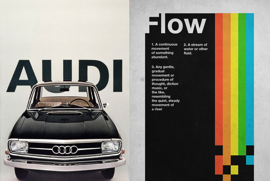
One of the few things in graphic design that’s been consistant for decades has been the Swiss, or International, design style. It’s a clean style that focuses on reduction of elements, typography, strong geometric shapes, and a gridded layout. There’s a reason why it has been a design style that’s lasted throughout the years. Now, don’t take me as an authority in design – I’m a lay person with no formal education in this field. I just appreciate pretty things, and this is just a hobby.
Starting in the early 1900s, Bauhaus pioneered modern architecture. Ornate elements and intricate patterns were removed, and anything that could be eliminated, was. These same principles were carried over to Swiss design – typography with sans-serif fonts like Helvetica, use of broad geometric shapes, and using empty space to contrast content. The design is stylistically neutral and the content drives the design.
The Metro Design Language is something that fully fits into Swiss design, but also puts an emphasis on usability. And while the desktop environment isn’t perfect for it (though it’s starting to work better), it has proven to be a great thing for the Xbox and Windows Phone, and will definitely be great for use on a tablet.

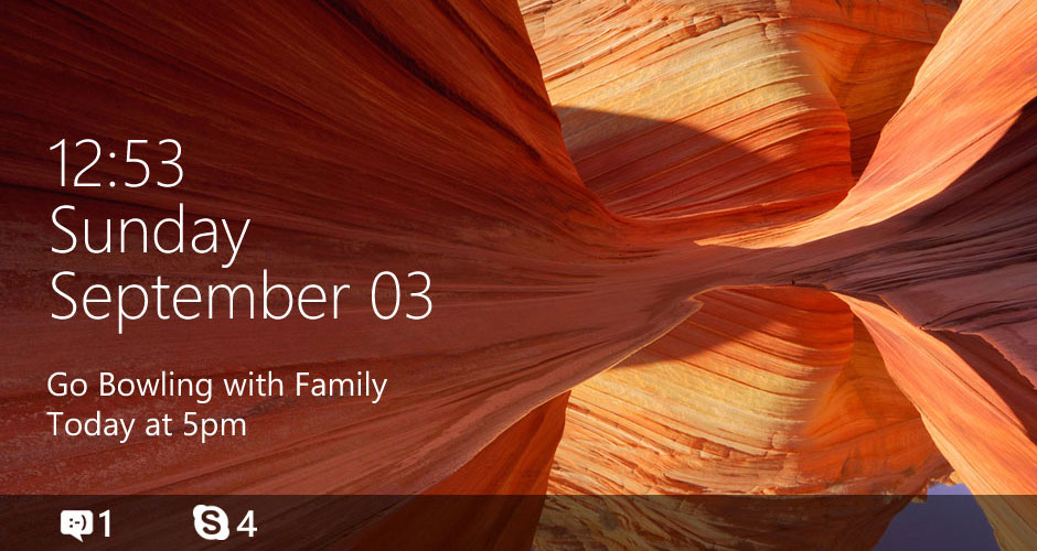
Windows 8 isn’t the first OS, mobile or not, to display notifications on the lock screen. Windows Mobile, Symbian, and Android all present the user with notifications and pertinent information on the lock or home screen. But one thing Windows 8 (and the whole Metro Design Language) does right is make the information important, and the design is just a framework for this. It doesn’t focus on the container for the content, but rather the container fits the content, or, in the example above, doesn’t even exist.
One thing that is emphasized in Swiss design is the use of photography as part of the design. Windows 8’s lock screen is one giant photo with information overlaid, and very few distractions. It’s clean, simple, and does the job while looking good. This is seen throughout the Metro UI. Some tiles on the Start screen, like News and Photography, will use a photo as the background of the tile. Most Metro applications will dedicate a big portion of their backgrounds to photography – headlines in News will have a big photo and Weather will show something related to current conditions.
Photography is a hobby of mine, and is something I wanted to emphasize on this site. Even if the photos aren’t necessarily photos, but images that are used as representations of things. The front page will continue to be a series of tiles with photos, and text is overlayed over the photos. Future posts will incorporate bigger pictures, both in the post and in the blog page.

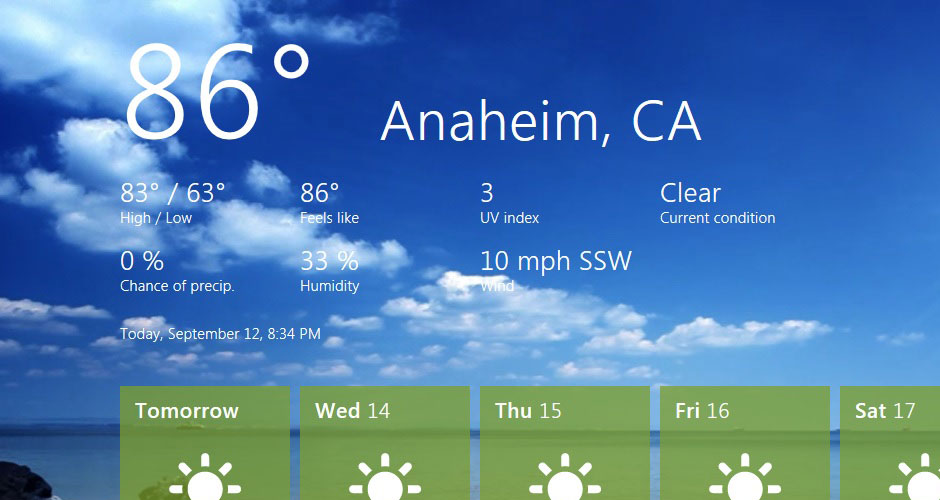
Another big thing in Swiss design, and Metro Design Language, is the use of typography to indicate importance of data. In the Weather application on Windows 8, the temperature, one of the most important things people care about when checking the weather, has the largest font size. And as the information becomes less important, like what the data means and the current date, the font size becomes smaller.
This is something I wanted to incorporate into the site design. Headers have large fonts. Meta-data (like the date) is smaller than the actual content. And of course, this text you are reading. This text is at a size that is easy to read, but isn’t so big that space is wasted. Not everything is perfect, but it’s much better than it was before, and improvements will be more incremental now.
I’ve also tossed in a few other elements that, I hope, are improvements. A geometric shape, the rectangle, is the main design element besides empty space (and boy is there empty space to the left and right of here). It’s a simple shape that is perfect for screens, as pixels aren’t round, but square. The site is more obviously gridded, and is fairly touch-friendly (larger elements). And all of these improvements that do no rely on shadows, rounded edges, and textures means that I use less images in the design, thus leading to faster load times.

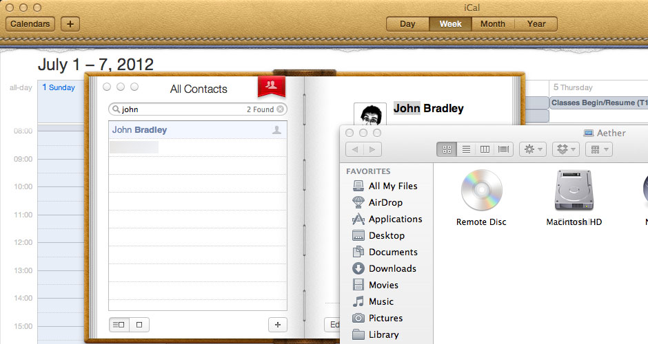
One thing Apple has done was push their own brand of design. For a long time, many, many websites implemented things in OS X, creating this whole “Web 2.0” look. Aqua buttons and gradients were plastered EVERYWHERE. It looked good, but got old very quick. It was a look that didn’t age well. Apple has been distancing UI design from the early days of OS X, toning down severely Aqua, removing ornate design queues and minimizing the interface as much as possible. But Apple has done a terrible job of creating a consistant UI design. In the example above, just three different applications all have different looks – one has stitched leather, another looks like an open book, and the last just has smooth gradients. And nearly everywhere where the background is not meant to be the main focus, Apple has been using a brushed-metal / satin texture.
And the web has adopted this look. The design of this site before this also used this kind of look. But, like Aqua, it is not timeless, nor ageless, and isn’t necessarily more usable. Even Jonathan Ive doesn’t like the faux-realism look. Take a look at his hardware design, and you can see why he has this opinion – his designs are not too dissimilar to Bauhaus or Swiss design. Geometric shapes, simplification of elements, and empty space. Something iOS and OS X doesn’t conform to.
This trend of using real textures, stitching, and shadows on the web won’t last long. People will get bored of it, find something new to use, and probably try to continue to look like OS X. None of it is timeless, and none of it will last. Swiss style may not stay forever either, but I think it will last longer than what’s trendy and popular right now. I wanted to redesign my site in a way thats a bit more sustainable, a bit more useable, and a bit faster. I believe I have done this, and brought a consistant feel to it. I will continue to tweak it, but hopefully now it should stay the way it is for the most part.
Unfortunately, not everybody can enjoy everything this design update has to offer. Windows and Mac users will see different fonts (Futura vs Segoe, Helvetica vs Arial). IE7 and 8 users will not properly render certain elements. IE9 and 10 users will not see smooth transitions for hover elements. And yet, the site will look good on nearly all devices, especially in browsers that use WebKit as their main rendering engine. I’ve yet to work out responsive design (which is the next big thing in web design), but for now, the design works fine for every size screen except for some of the smallest screens out there.
